
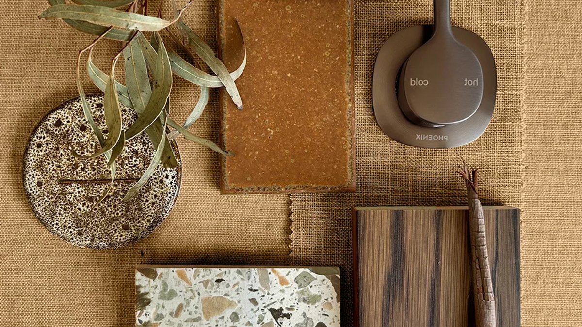
After years of cool whites and greige interiors, Australian homes are warming up again, showing whitewashed neutrals the door while inviting in richer tones. This shift marks a move away from the eclectic tastes of the 90s and a pull back from maximalism into a new era of “midimalism.” The defining palettes are moodier and more atmospheric, reflecting a distinctly local resonance with the country’s setting.
Why caramel and bronze are the colours defining 2026
The move to warmer, more inviting tones has seen caramel and bronze taking over as the colour du jour. This shift has been fuelled by a growing adopt of biophilic living, a connection between nature and indoor living that relies on textures, materials, and light to bridge the gap. The nature-inspired colourways and rich materials are helping Australian homes to feel calmer and more restorative with just a few simple edits, creating a sanctuary that prioritizes wellness.
Bronze has emerged as a versatile alternative to traditional metallic finishes. Softer than black and warmer than chrome, it pairs effortlessly with timber, natural stone, and textured surfaces, making it an easy addition whether you’re renovating a whole home or simply updating tapware. This versatility sees the sophisticated finish lasting beyond changing trends, instead continuing to complement evolving interior aesthetics. Phoenix Tapware’s latest Brushed Bronze collection offers a distinctive tonality that lends itself to an earthen depth, rather than the classic, orange-based copper notes. The range works well in a myriad of aesthetics and rooms, particularly when paired with the warmth of the brushed finish and Phoenix Tapware’s unique unchanging tactile bronze colourway.
Using a tonal family across walls, ceilings, joinery, and even furniture creates a space that feels layered and inviting rather than busy. This approach, often called “colour drenching,” incorporates caramel, soft oat, and bronze tones into one space without overwhelming it. Rather than a trend, 2026 calls for the timeless aesthetic of organic decor, with ‘midimalism’ and ‘colour drenching’ leading the way.
Related: Escape to these peaceful NSW retreats
Bringing the palette to life
It is easy to see why these earthy hues work so well in local homes. The warm, grounding tones echo the sunburnt earth and weathered timber that define the Australian environment. This creates an interior that feels less like a designed space and more like a natural extension of the outdoors, blurring the boundaries between inside and outside living.
This warming tone was inspired by Australia’s setting, providing a foundation for interiors that feel connected to the natural world. To successfully let 2026’s answer to neutral take over your home, these design moments are what really bring the palette to life. While adopting textures and organic decor — such as timbers, leather and ceramics — for depth and warmth might not be a new trend, specific pieces can raise the aesthetic. Look to add visual intrigue with a rustic take on modern terracotta with The Balcony Garden’s Modern Urn or raise your living space with a plush, textural leather sofa, such as Castlery’s Lena Leather Chaise Sectional Sofa.
Whether woven through an entire home or introduced in subtle touches, caramel and bronze create interiors that feel warm, grounded, and beautifully connected to the Australian setting. It is a return to a style that feels lived-in and timeless rather than strictly seasonal, offering a calming retreat for the modern homeowner.


