
Choosing the right paint colours for a renovation can feel like a puzzle, especially with countless brands promising the best finish.
What to look for beyond the hue
First, consider the surface you’ll be covering. Bathrooms often need mould‑resistant formulations, while kitchen benefits from scrubbable, hard‑wearing finishes. A matt emulsion works well in bedrooms, offering a soft look that doesn’t reflect light harshly.
Quality matters. According to a buying manager at a major home‑improvement chain, paints with 30% to 45% binders and pigments tend to deliver better coverage and durability. Lower‑binder products may require extra coats and can show streaks or fading.
“Different qualities of paint will have different levels of ingredients,” the manager explained. “Higher‑quality paints have a higher percentage of binder and pigments, resulting in a better finish.”
When testing a product, watch for patchy drying, streaks, or easy marking. These signs often indicate a lower‑grade formulation, though they can also stem from inadequate surface preparation.
Balancing trends, timelessness and sustainability
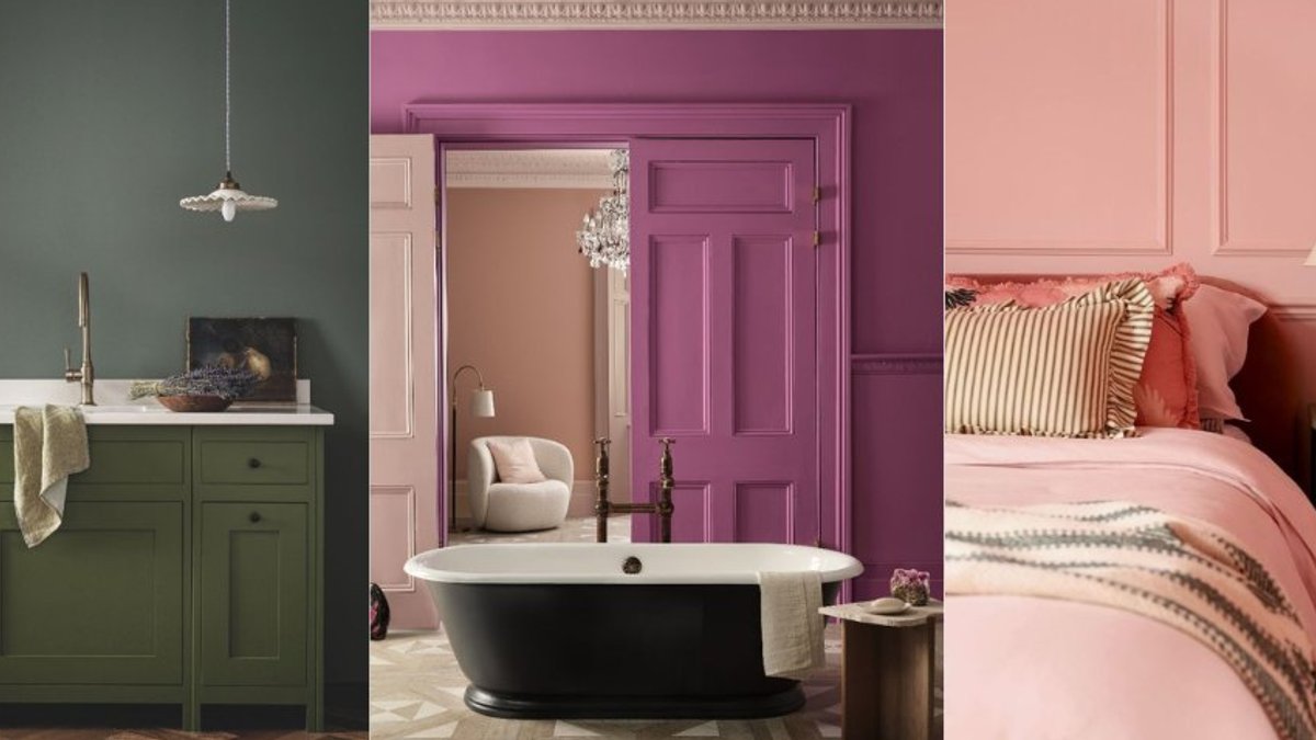
Designers frequently recommend a mix of bold accents and calmer backdrops. In a kitchen designed by Melissa Hutley, the units feature a striking Invisible Green from Edward Bulmer, while surrounding panels use a softer Celadon tone.
For bedrooms, soft greens such as Terre Verte from Annie Sloan create a tranquil atmosphere, and deeper shades like Jewel Beetle by Little Greene add a moody richness that can suit any season.
Eco‑friendliness is increasingly a deciding factor. Some paints contain volatile organic compounds (VOCs) that emit odors and contribute to greenhouse gases. “All major paint suppliers are much more ecologically aware,” says an interior‑design consultant. Water‑based, VOC‑free options are now common, allowing homeowners to choose greener products without sacrificing colour.
Sample testers can also be sustainable. Certain peel‑and‑stick samples use real paint but contain 0% plastic and significantly less paint than traditional pots, reducing waste while letting buyers observe colour shifts in different lighting.
When a specific shade is essential, colour‑matching services exist, but they may not always replicate premium pigments accurately. “Colour matching doesn’t always work as expected, especially when comparing premium paints with cheaper alternatives,” a colour consultant noted. Rich, natural pigments respond to light, adding depth that cheaper formulations often lack.
Choosing a paint is not just about the pigment; it’s about the finish, durability, and environmental impact. A balanced approach—testing samples, consulting experienced decorators, and weighing the trade‑off between cost and quality—gives the best chance of a successful renovation.
Pick wisely.


